Another Bite
Branding
Strategy
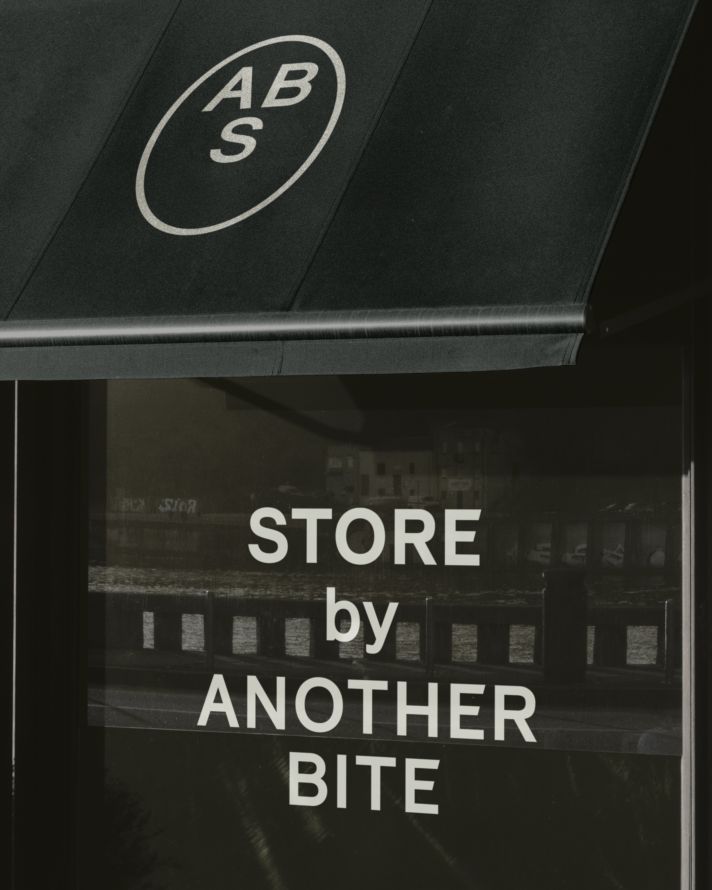
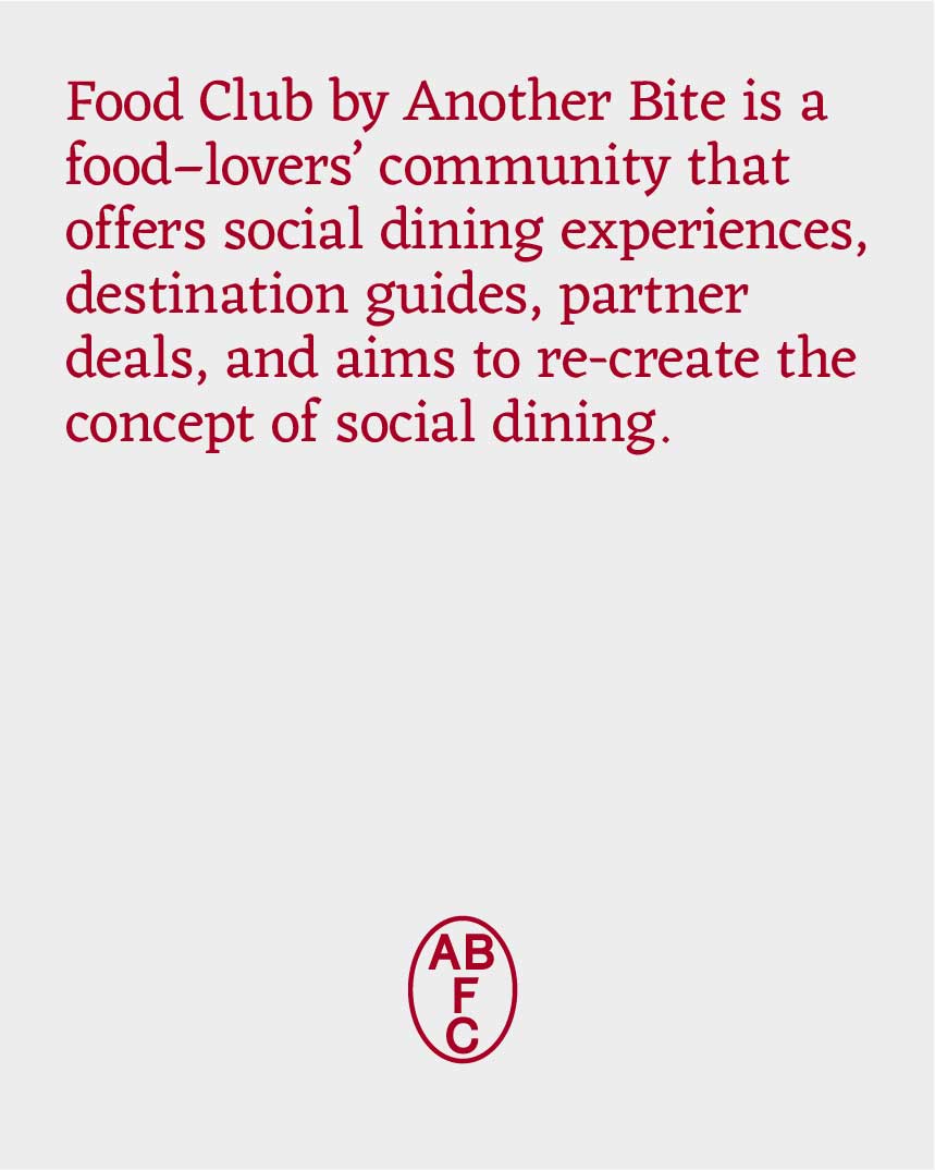
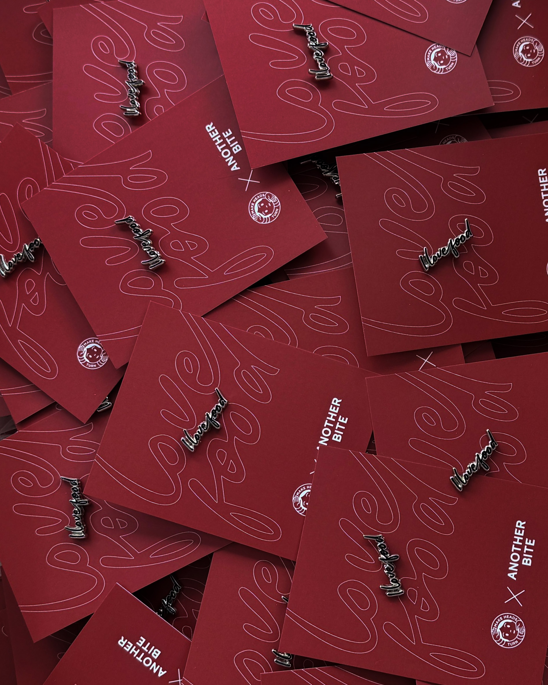
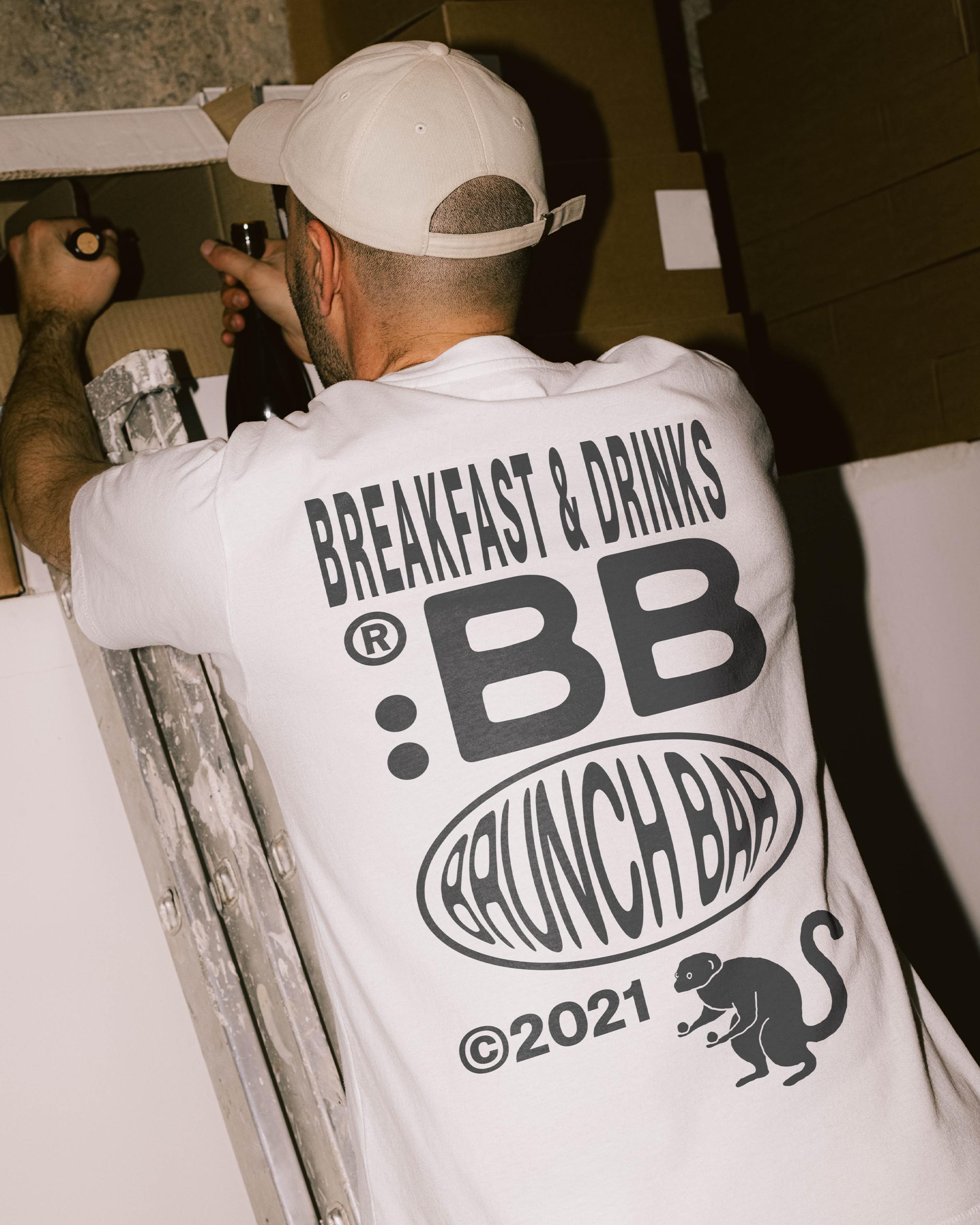
Another Bite is Eglė Mascarenhas years-long collection of initiatives designed for food enthusiasts. From Food Club to Agency, all aim to communicate the profound love for food.
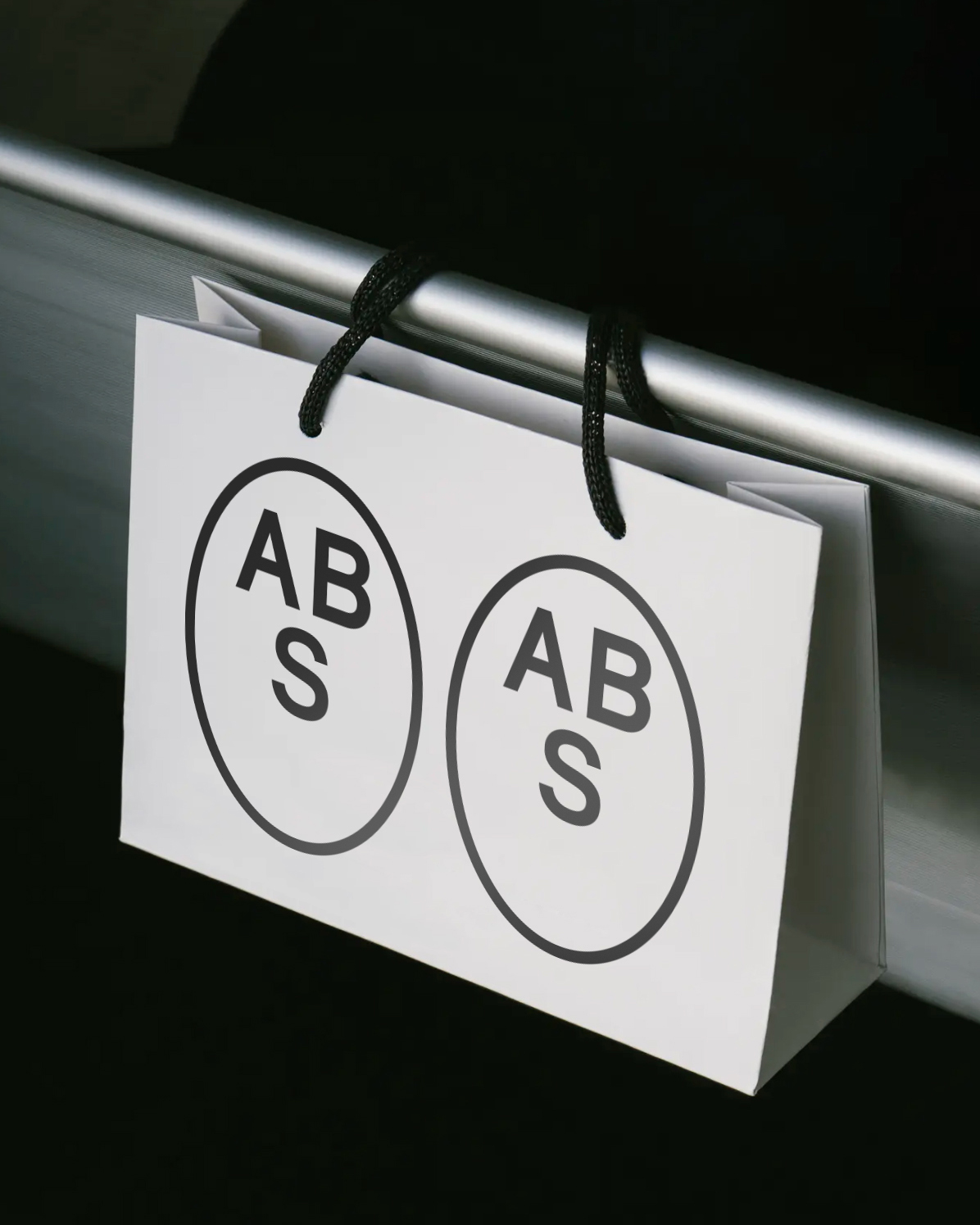
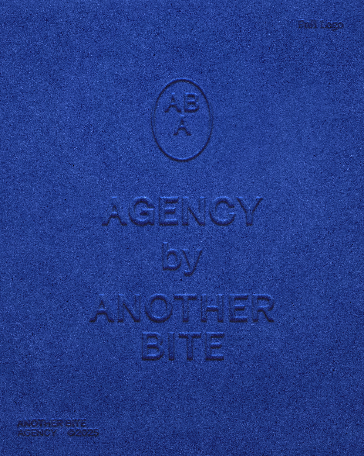
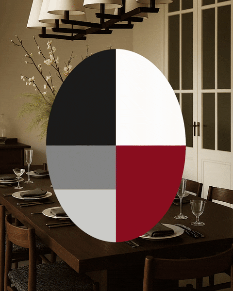
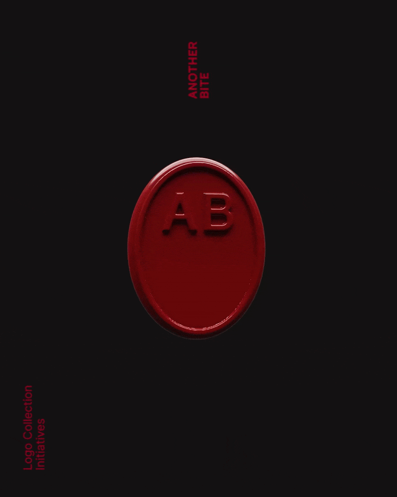
The multidisciplinary focus of the brand led to the logo designed as a flexible system, not a fixed visual. Simple graphic attributes act as building blocks, allowing the logo to adapt for each initiative in a conceptual way.
The logomark is an umbrella symbol that purposefully has white space beneath it. Enveloped in an ellipse of community, it embodies a table to be gathered around, food to be served, and new lanes to be opened. All under the multifaceted but very personal name.
The project inspired an essay on the dynamic elements within branding that also takes a deeper look at the project workflow. The project has also been published on The Brand Identity, Rawart Studio, and Logos.ai.
Read the essay here.